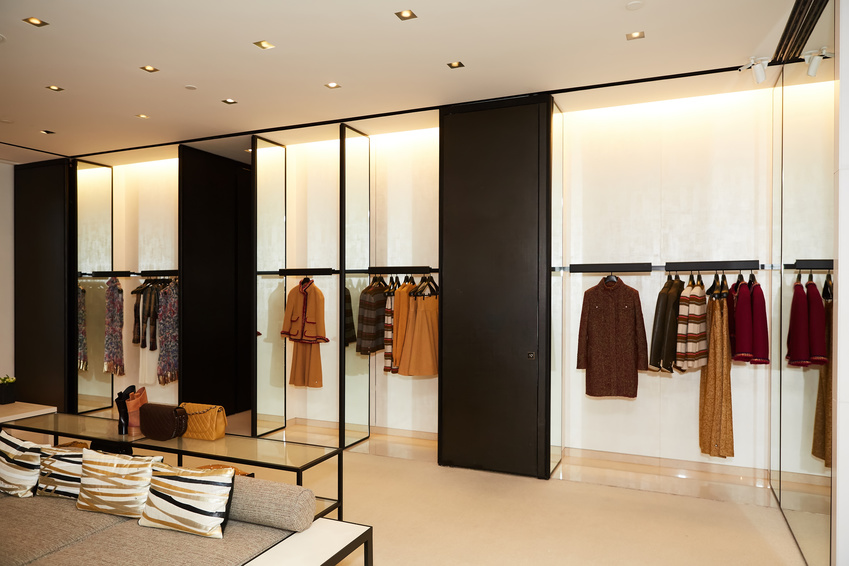
Retail design is the art of creating a space that makes customers want to engage with and purchase your products and services. A thoughtfully designed space can help increase your sales, while a poorly designed one can lose you both current and future sales.
Focusing on a few key elements during the planning stages can help set your retail business on the road to success.
Find the Right Floor Plan
The floor plan is the skeleton of your space and one of the key drivers for sales. The best floor plan for your retail space depends on the type of business you have.
If your products are largely displayed on shelves, for example, you may need a grid-based floor plan. A coffee shop or clothing boutique requires a different approach, such as an open or free-flow plan.
Retail design that combines floor plan types is often the most flexible, offering a variety of customer experiences while still meeting important customer expectations.
Whatever type of floor plan you select, it should invite customers to interact with your products and staff. Providing adequate space for both displaying your products to their best effect and to allow customers and staff to move around with ease is crucial.
Direct Customer Attention to Key Products
Combine customer-flow planning with flexible visual cues like directional lines and colors to subtly guide your customers to your most important products. Take care that the flow feels organic rather than forced. Observe how customers move through similar retail spaces in your sector. Do they spend time with products or move quickly from area to area? The retail team at Smartsheet has some good tips for examining customer flow.
Make the Customer Feel Comfortable.
Consider not just how your space looks, but also how it sounds and feels.
Marketer Paco Underhill, author of Why We Buy: The Science of Shopping, recommends retail spaces maintain a “transition zone” that allows customers to acclimate to the retail environment when they enter a store. According to Underhill, the transition zone should be free of important products or messages because people won’t see them until they’ve transitioned from street to store and moved further into the space.
Providing adequate space for customers to move comfortably through the store and to spend time looking at your products is crucial. Aisles and pathways should be at least three feet wide to comply with the Americans with Disabilities Act. In addition, look out for places where bottlenecks could occur and avoid putting merchandise there – customers will avoid crowded areas.
Good retail design also takes acoustics into consideration. A space with poor acoustics can feel “warehousy” and make customers uncomfortable. Consult your architect about sound-absorption materials that will fit in with your brand’s aesthetic.
Proper ventilation is important for any building, but it is especially important in retail spaces where odor is apt to accumulate. This is obvious in industries like restaurants or beauty salons where smells are intrinsic to the services provided, but it also applies to any shop selling scented goods. Even pleasant odors can quickly become overwhelming, particularly for customers who are especially sensitive to smells.
Incorporate Zone Merchandising into Your Retail Design
Zone merchandising is a classic retail strategy that directs customers to the products they’re looking for while exposing them to additional products they might buy. For example, a business’s best-sellers and anchor items may be located near the back of the retail space, while additional “might-buys” are strategically placed in the customer’s path to the back.
Other typical zone merchandising strategies include impulse-buy placement (often near registers) or end-caps, as in grocery stores.
When planning your retail design, think carefully about your zones and how you might use them with your inventory of products. Include space to accommodate the displays you might need at each point.
Make Your Products the Star
Don’t go overboard on fancy fixtures or displays. Make sure they reflect your brand but don’t overshadow your products. If the product is the diamond, the display is the setting – it should direct the eye to the star of the show rather than drawing attention to itself.
Fixtures are a permanent element of your design and need to be carefully integrated into your design, but displays are more forgiving. Because they are usually moveable, aim for maximum flexibility with your displays. This will allow you to try different placements and visual marketing strategies to see what works best to make your products stand out.
Don’t Forget About Storage
It isn’t as sexy as the retail floor, but your space’s storage areas can have a huge impact on your ability to move merchandise. Make sure you have adequate space for current stock plus room to grow your inventory. Again, flexibility is important, especially if your product sales are season-dependent.
Consider your storage space’s effect on workflow. Think about where on the retail floor your staff need to spend the most time and make sure they can get to and from storage areas quickly. When possible, include storage space on the retail floor for best-selling items that tend to turn over quickly.
Working with an architect who is familiar with both your industry and your location can help you incorporate all these elements into your design planning to ensure your space is ready to provide a great experience for your customers and maximum sales for you.


