Have you ever walked into a room and been surrounded by colors that made you feel more alive? Or entered a space that immediately made you feel calm, safe and tucked away from the turmoil of the outside world?
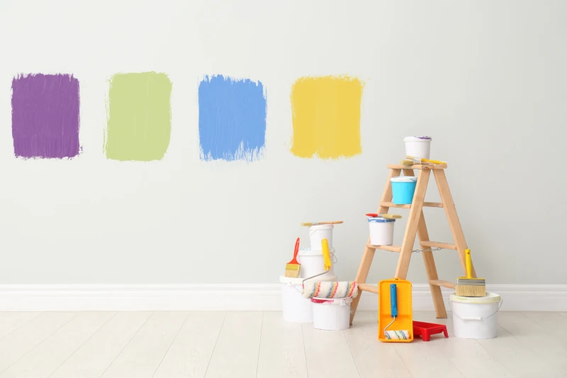
Colors can influence our moods.
Vibrant colors like orange, yellow or bright green can make a room appear lively and energetic. If we are seeking calm, cooler tones like blue or muted shades of green can create a more serene atmosphere.
If you work with an architect, the advice is often to use relaxing, soothing colors for bedrooms and choose brighter colors for living spaces, like dining or family rooms.
Colors influence how we perceive spaces.
Did you know that colors can make a space feel larger or smaller? Sounds a little like those pills that Alice took in Wonderland. But with colors it’s true.
The colors you choose to paint a room can be influenced by the size of the room. If you’re working with a small space and want it to appear larger, choose lighter colors, which reflect light.
If you’re working in a large, open space and want to make it feel less cavernous, choose dark colors that absorb light. They can make a room feel smaller yet cozier and more intimate.
What are the effects of light on color?
In bright light, a paint color can appear to be one shade or color. In low light, a different color. This is especially true of hues of green and blue. Artificial light and natural light can also change the appearance of colors. That’s why some paint companies suggest that you paint a swatch of the color you like on a wall, live with it a day or two, and look at it as the light changes. North-facing rooms might benefit from warmer colors to balance the cool light. South-facing rooms might benefit from cooler colors to complement the abundance of warm light.
Historical and contextual considerations.
Living in Northern California, most of us are very familiar with the often-intricate color schemes on the exteriors of Victorian homes. Dark reds, browns, olives, greens and maroon are common colors. Among a row of brightly colored Victorian homes known as the Painted Ladies of San Francisco, you’ll find dark hues next to bright, vibrant colors. The contrast brings out the details. The interiors of traditionally outfitted Victorian homes also featured darker tones, with shades of red paired with green, or perhaps purple.
Marin County includes a large number of Eichler and Alliance homes. Though these homes are newer, mid-century designs, Eichlers have their traditional color schemes, as do Alliance homes. They still offer variety, but the exterior colors lean toward more neutral, earthy hues.
If you’re about to tackle a remodeling project, or simply looking for advice on how to choose the right paint color for your space, AplosGroup would love to help.