Does your tasting room reflect your brand?
One of the great pleasures of living in the San Fransisco Bay Area is visiting the wineries of Napa and Sonoma Valley and beyond. But sometimes I find myself sipping fabulous wines in spaces that are … less than fabulous.
Why?
Winemakers put an incredible amount of care into the wines they make, but winery tasting rooms are too often an afterthought rather than a reflection of the products they are meant to highlight.
As an architect and a lover of fine wine, there are a few things that I look for in a tasting room.
Create an Invitation to Interact
Most of the winemakers I’ve met are eager to talk about their wines. They hire tasting room staff who are passionate and knowledgeable about the products they sell. The space they work in should make it easy for the visitor to interact with staff.
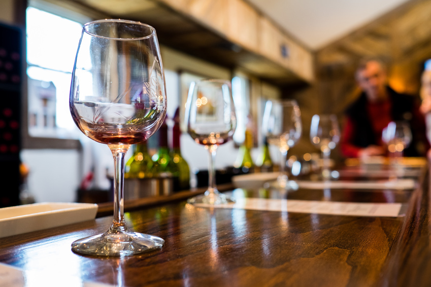
The traditional walk-up bar is fine, but it should be an invitation to interact rather than a barrier between staff and visitor. Marble or copper may be beautiful, but they are less warm and inviting than materials like natural stone or wood. And of course, bar materials should be resistant to stains and spills.
A curved line can draw visitors in, making the interaction feel more like a conversation than a transaction.
Make a Space for Conversation
Visitors to wineries in our area tend to come in two flavors: tourists who may or may not be wine enthusiasts, and wine lovers, both local and from around the world. You want to give both types a comfortable space for relaxing with a glass of your best. Casual tourists may need a break from wine touring, while wine lovers need a space to discuss what they’re tasting with their friends and colleagues.
The bar shouldn’t be the only gathering point in the tasting room. Comfortable chairs and small tables positioned away from the bar are ideal, so that visitors don’t feel pressured by staff. If you’re lucky enough to have a deck, garden, or other outdoor space attached to your tasting room, consider providing shade to protect your visitors from intense Northern California sun.
Calistoga’s Tank Garage Winery uses its unusual space–the tasting room occupies an old gas station–to create a unique and inviting gathering space, with its speakeasy-like atmosphere and pinball machine.
The Tasting Room Should Reflect the Wine
Every good winemaker has a style, even if she creates lots of different types of wine. Your tasting room should reflect your overall style and the image you’d like people to associate with your products.
Are your wines bold? A tasting room with bright colors and strong geometric shapes might be a good choice.
Earthy wines may best be showcased by a tasting room design that features natural materials, colors, and textures.
Wineries that favor classic, Old World styles may benefit from designs that carry references to their European influences.
Work with the Environment
Wine tasting rooms, like all architectural designs, should work with rather than against the environment they’re set in.
Even if your products get their inspiration from, for example, the great Italian wines, your tasting room doesn’t have to be a carbon copy of an Italian villa. Architectural or other design hints of its Italian heritage are enough to suggest the connection while maintaining your winery’s firm footing in California.
If your winery is set in a beautiful valley, take advantage of it by extending your tasting room to the outdoors with a welcoming deck or patio. Or let large windows overlooking the valley take center stage, reminding visitors of the unique terroir that produces your grapes and wines.
Tasting rooms set in urban areas are in a great position to distinguish themselves with spaces that reflect the vibrant communities they’re in, using local trends in their aesthetic. Take inspiration from stand-out businesses in your city rather than trying to emulate the traditional country or agricultural feeling of wineries outside town.
Berkeley’s Donkey & Goat, for example, perfectly reflects that city’s casual, funky vibe, with its mix of rustic and industrial design, local art, and comfy club chairs.
And, of course, as part of a business that depends on our natural resources, your facility should reflect a commitment to sustainability, from both an ethical and a business standpoint.
Update Your Tasting Room
So many tasting rooms I’ve visited seem stuck in the ’90s, or even earlier. Like other showrooms, wine tasting rooms need to keep up with current architectural and design trends or they risk looking out-of-touch with consumers. This doesn’t mean you have to go through a major renovation every five years. Look for opportunities to update that don’t cost much and won’t disrupt your business. Adding new art, for example, can refresh your tasting room. Or try repainting a complementary color behind the bar if you’re not ready to commit to a whole new color scheme. New seating, new water pitchers, new glassware … there are many possibilities that can refresh your tasting room’s look without breaking the bank.
Most public-facing businesses should consider doing a major renovation at least every ten years–more often if the brand experiences a major change in direction. An architect who is knowledgeable about the wine business and wine tasting rooms is in the best position to advise you about design options that can help you show your wines to the best advantage.
Contact us to schedule a consultation.


